

this website
skills
timeline
team
overview
it was essential that my portfolio conveyed my personality at every
point of the experience. i started with three words that describe me
to build my brand's identity upon: vibrant, weird, and playful.
i also knew from the get go that i wanted to code the site from
scratch. i love a good challenge, i learned a ton in the process,
and there are absolutely no limits to what i can do with my site.
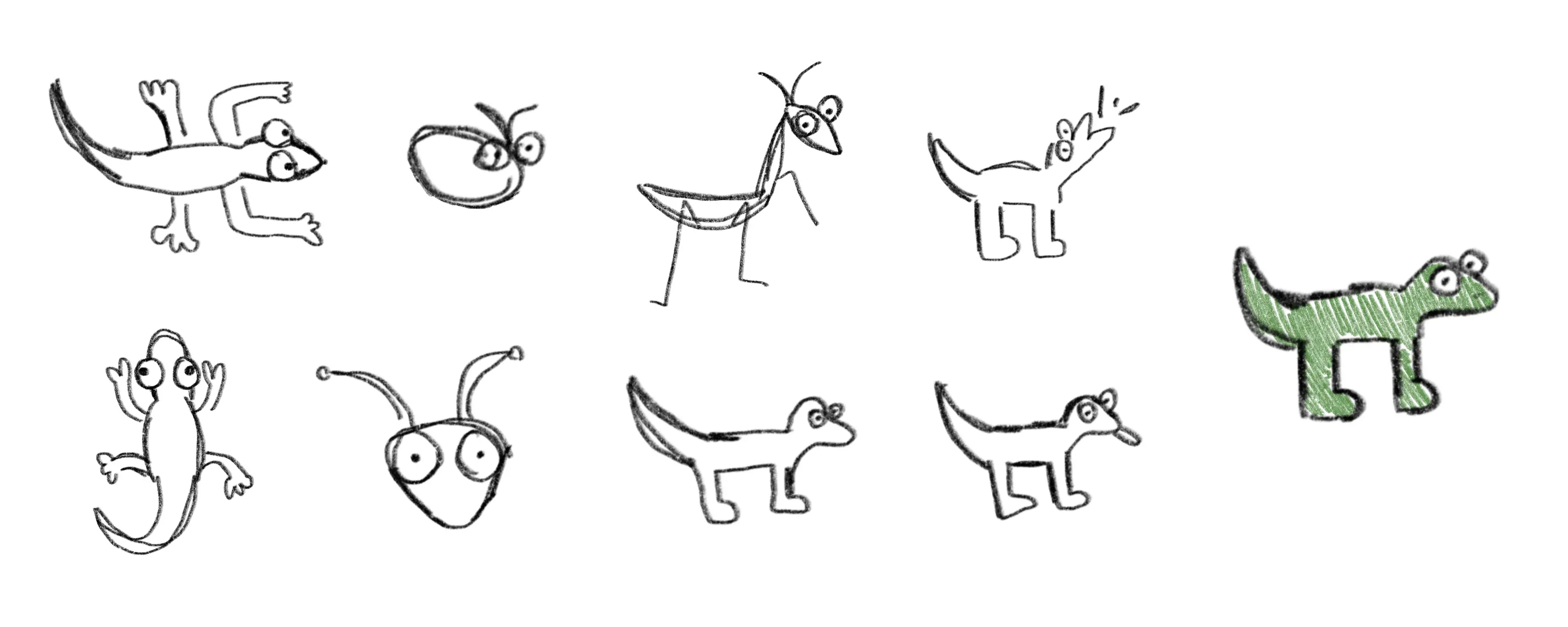
logo creation
through exploring other work and taking inspiration, i realized i've
always been drawn to animal logos. nothing else would represent me
properly. i love reptiles and insects, and with the right style, i
knew the logo would also express my weirdness. you can see
variations in my sketches, but i ultimately decided on a simple
lizard with very wide eyes as the logo.
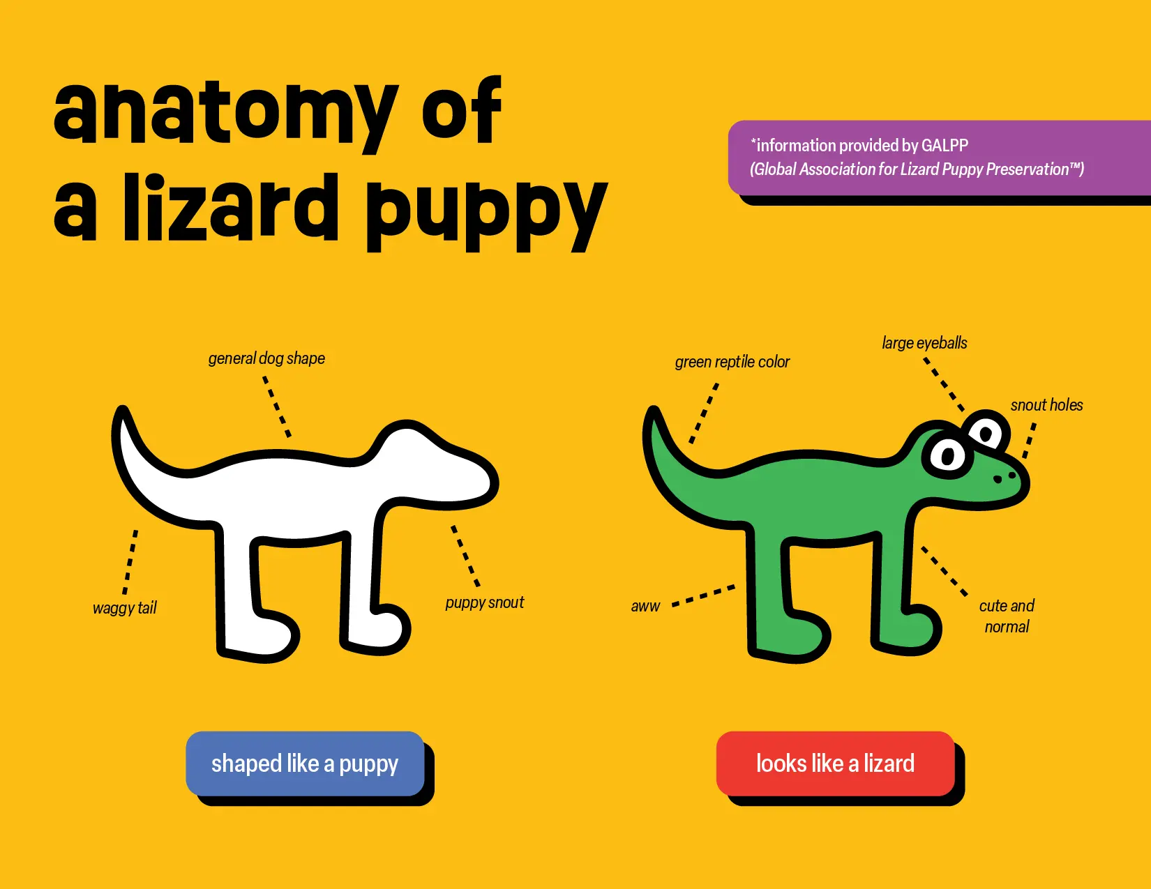
this isn't your everyday lizard. he's unique, he's got that special
something. yes, you've got it! this is a "lizard puppy." being the
first and only of its species to exist, he will live out his eternal
lifespan on my site. make sure you click on the lizard puppy to pet
it.
brand identity
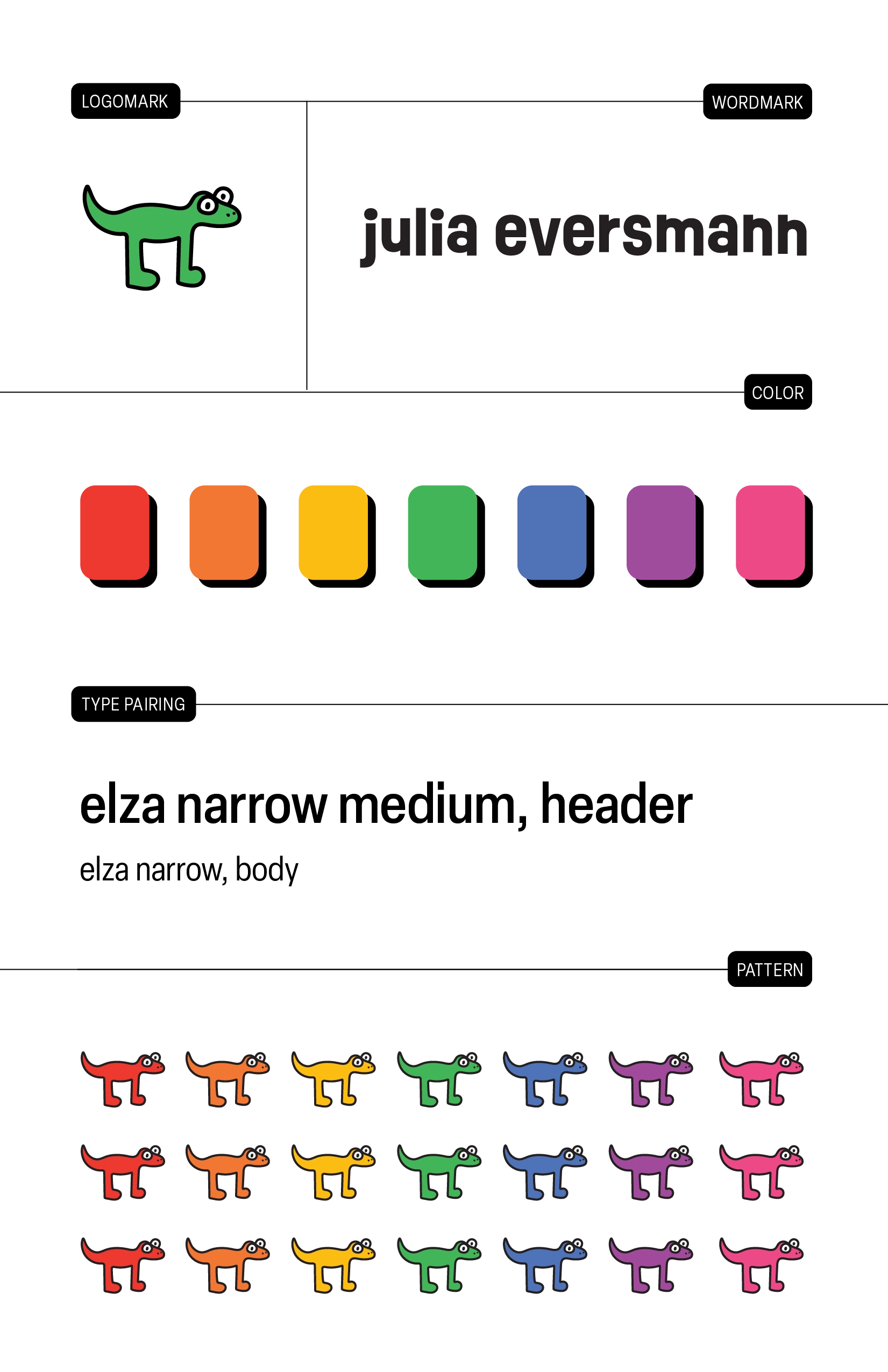
my favorite color is rainbow (yes, that's a valid choice) and the
color palette reflects that. the background color is a bright
mustard yellow, making the overall tone warm and inviting. the
foreground colors bring in the other colors of the rainbow, at
shades that i felt were bright enough to reflect my energy while
still being accessible.
the display type, ruddy, is used for the wordmark only, as it is
more readable at larger sizes. the other display and body text on
the site is elza narrow, a low contrast font great for web that
still feels connected to the wordmark through its letterforms and
narrowness.
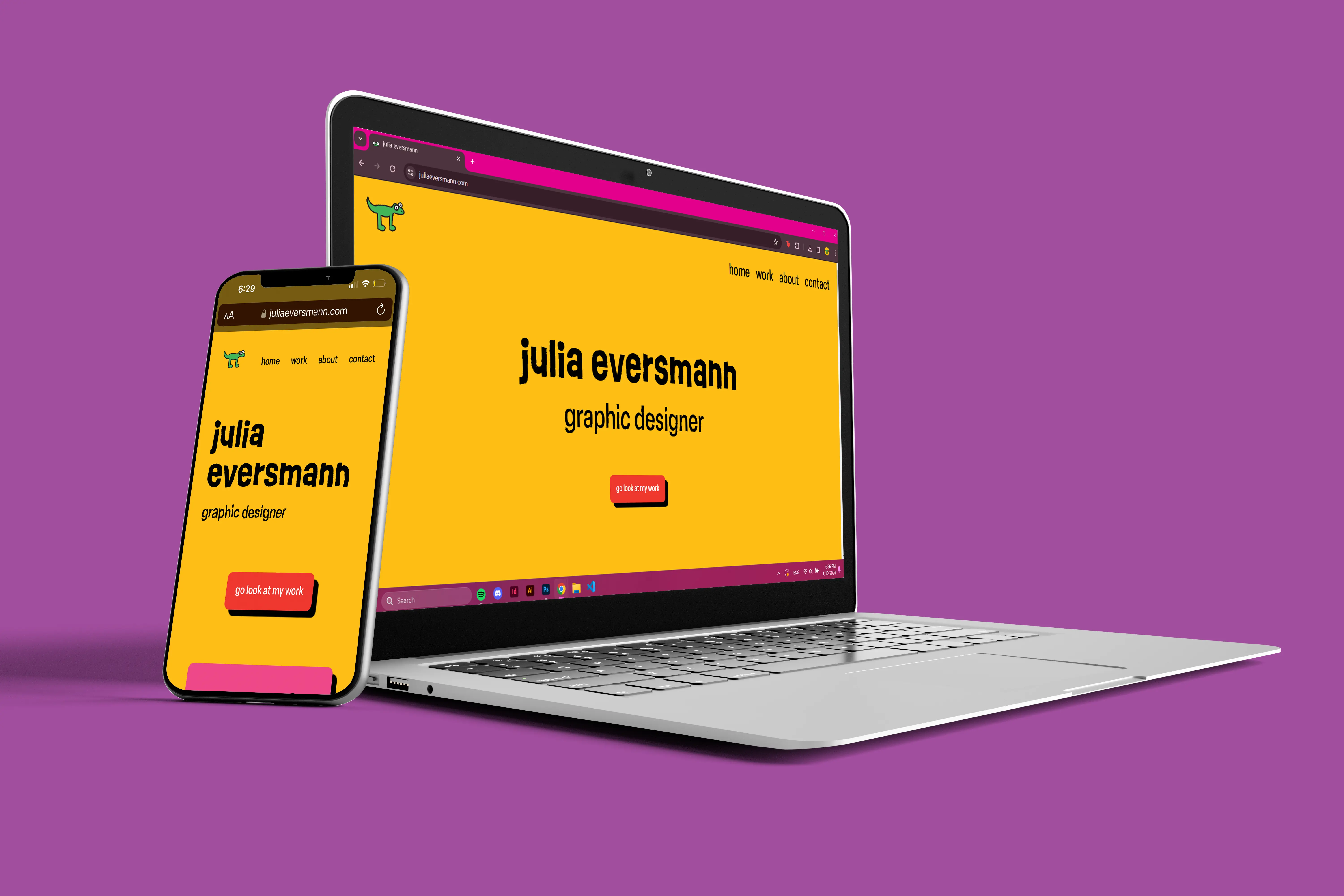
layout
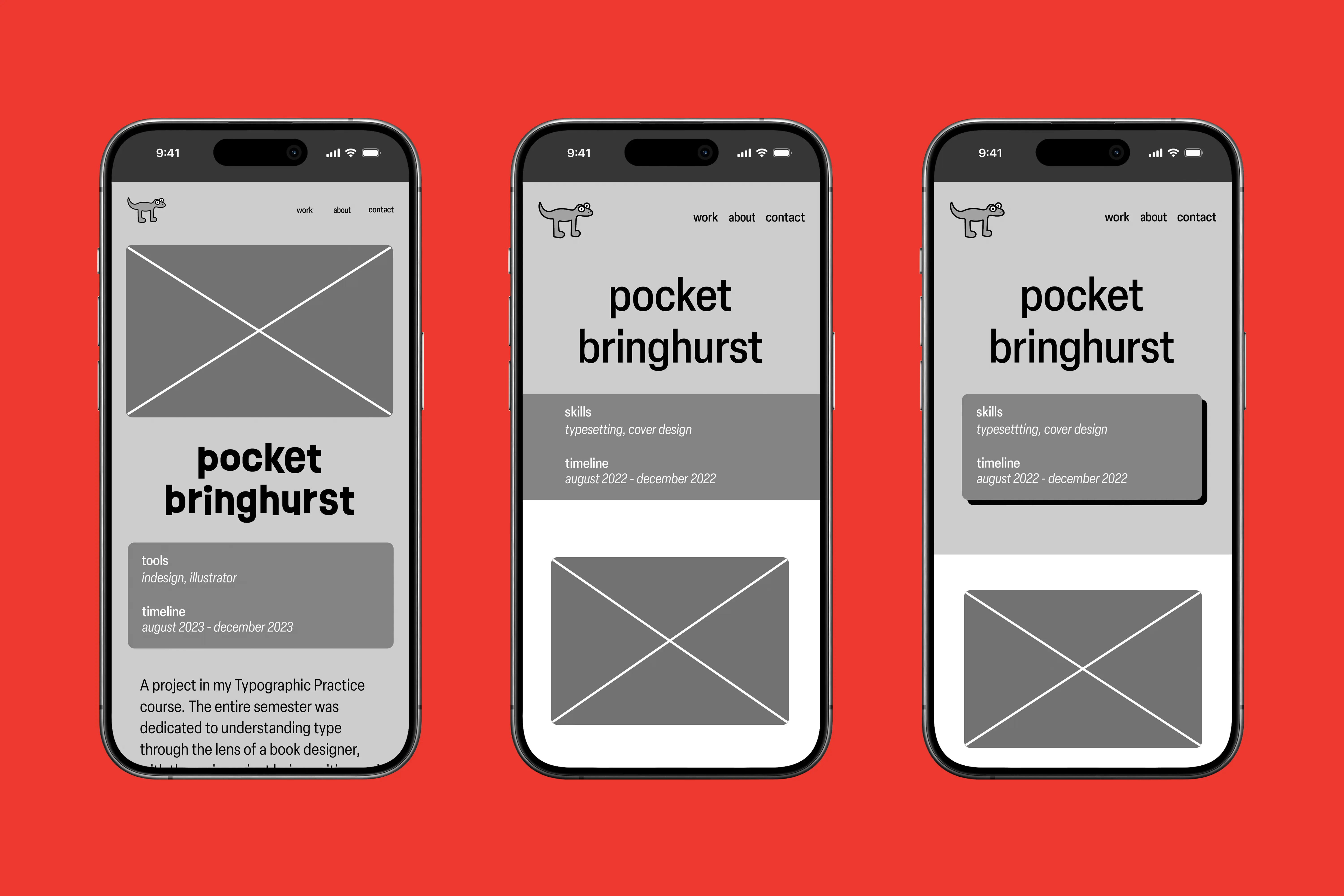
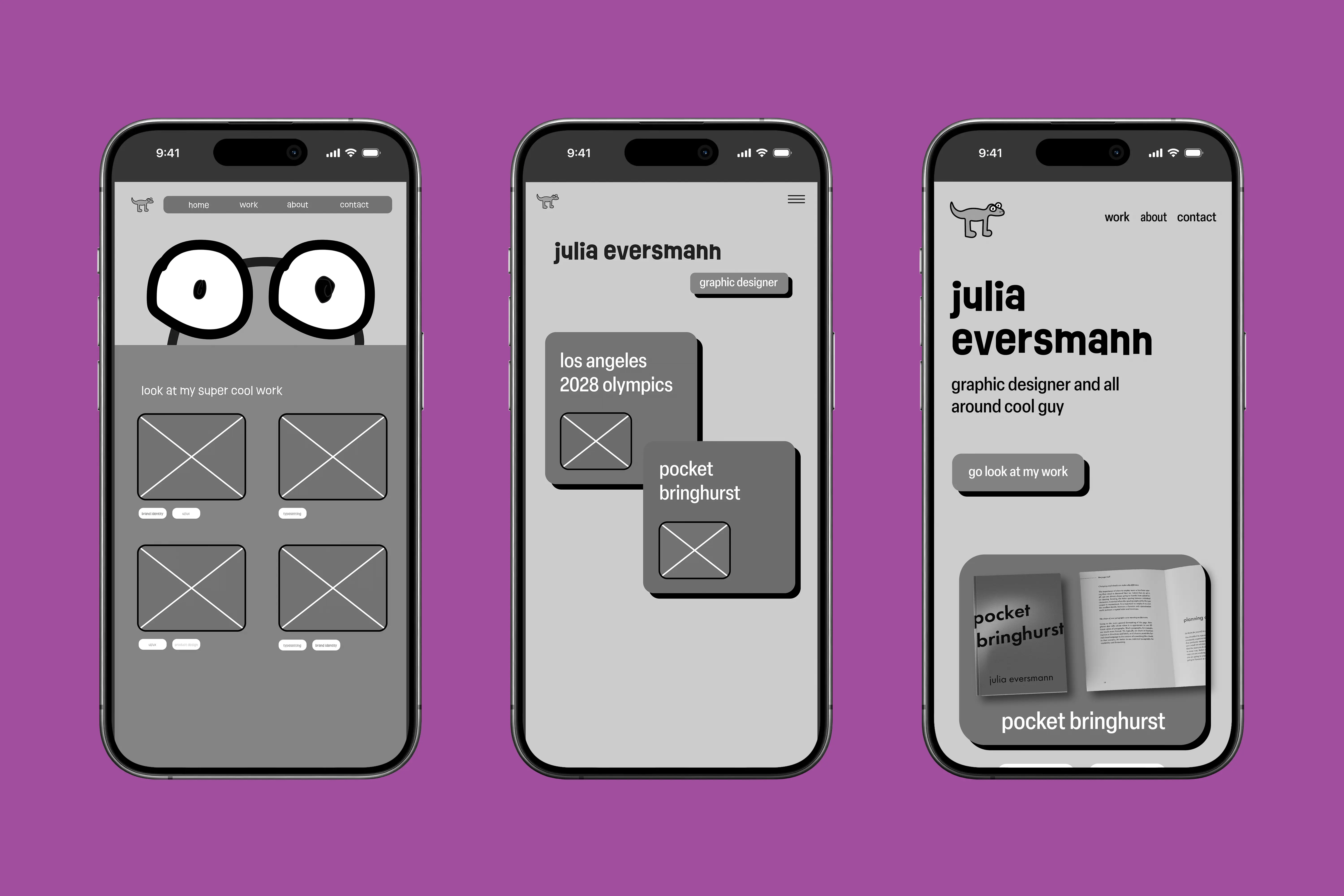
i prototyped many different layouts to see what would best present
my work. with such a strong brand personality, it was essential that
my work was easy to navigate and had its own space to shine. i
decided against over designed pages so that there is no distraction
from the content itself; the layout is simple and clean.
this site needed to be playful,
kinetic, bringing my work to life.
using an svg filter, certain elements on every page are textured and
moving, bringing a stronger sense of energy than still graphics
could achieve. this is especially effective in bringing my logo to
life, as it is an actual creature.
coding
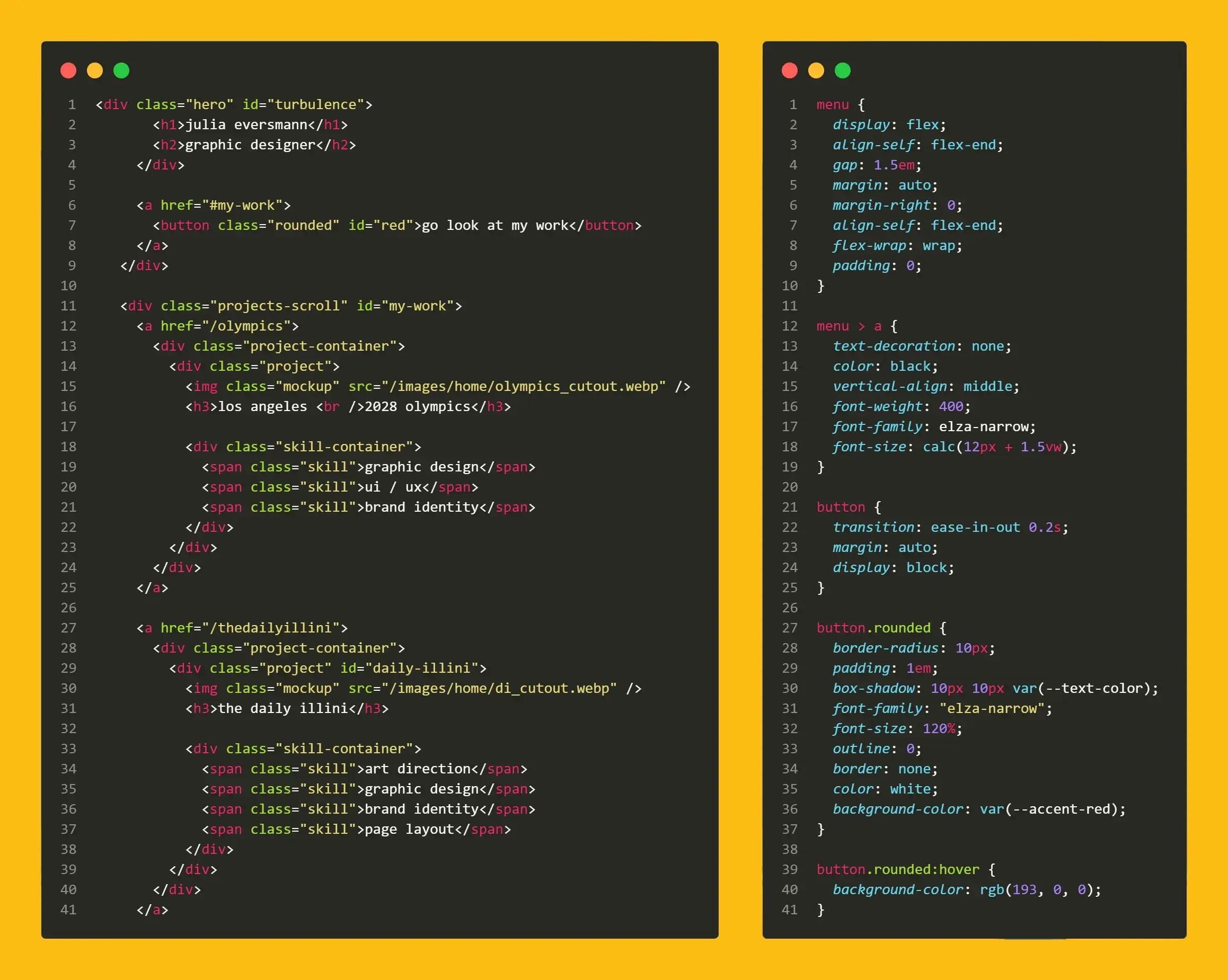
i was familiar with html and css before coding this site, but i
learned so much more about proper architecture and organization
because i was doing it all from scratch. i worked with my partner
matt novelli to
bridge the gap on more unfamiliar concepts, like javascript and root
styles, but the majority of the site was done by myself. i found
myself absolutely loving the process, and i'm itching to experiment
with css whenever i get the chance.
i consistently checked the accessibility of the site using color
contrast checkers and pagespeed insights, making adjustments as
necessary.
the site is hosted on github, you can explore the code
here. it was my first time using git, so there was definitely a
learning curve!
in the future
my portfolio is a neverending project, and i work on it very often. i'm currently working on adding more portfolio projects, improving accessibility, and implementing more elements of my visual identity.