LTC Rebrand
starting from scratch for a statewide leader in edtech
Skills
Tools

Brief
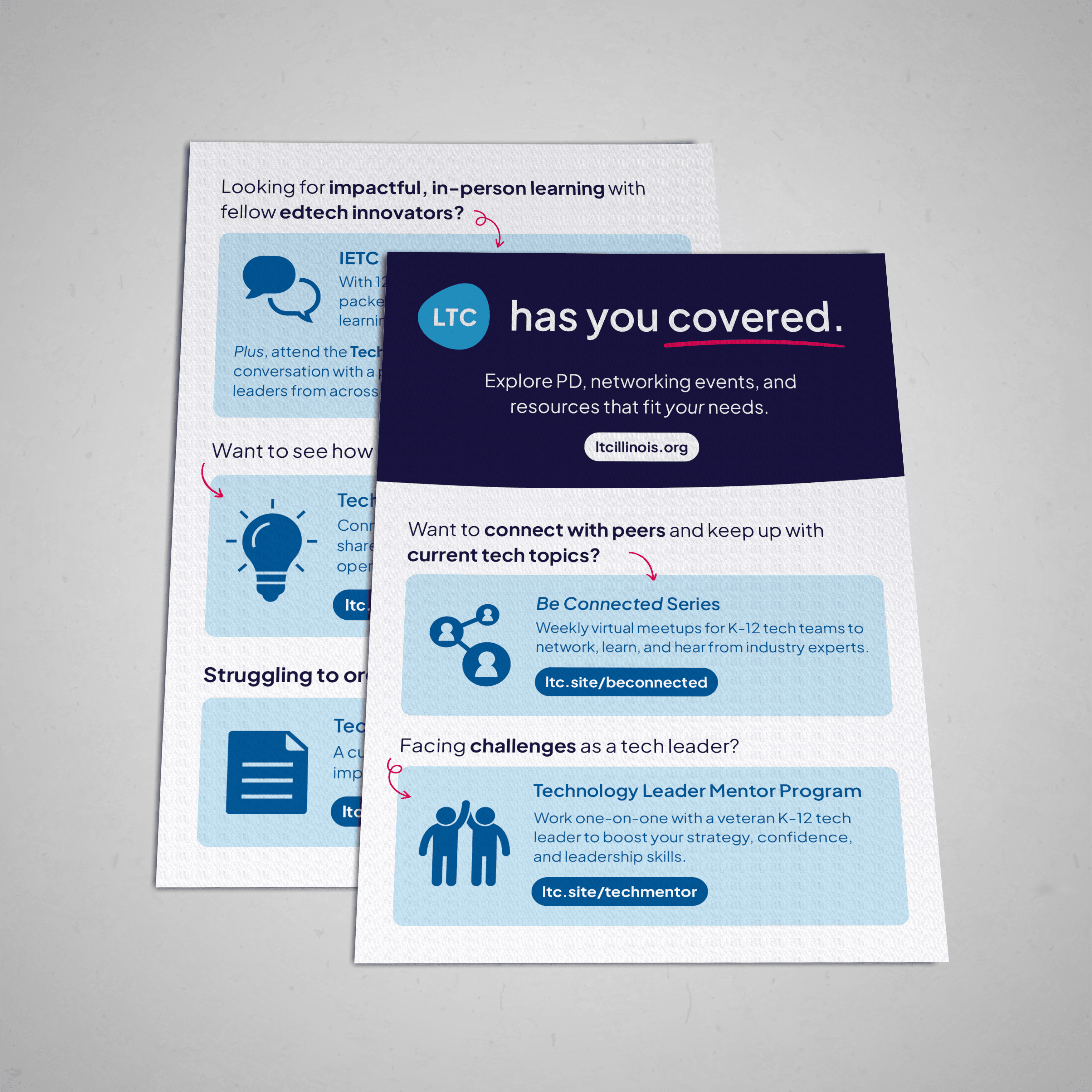
Less than a month into my role as Multimedia Designer at the Learning Technology Center, I was assigned a big task: leading a full rebrand of the organization's visual identity. The LTC serves all public K–12 schools, districts, and educators across the state through a wide range of tech initiatives and professional learning programs. Its existing visual identity had been created several years before, and the organization had quickly outgrown it. As the state's primary leader in K12 edtech, its brand needed to reflect the modern services it had to offer, but also maintain recognition with its already existing audience.
Result
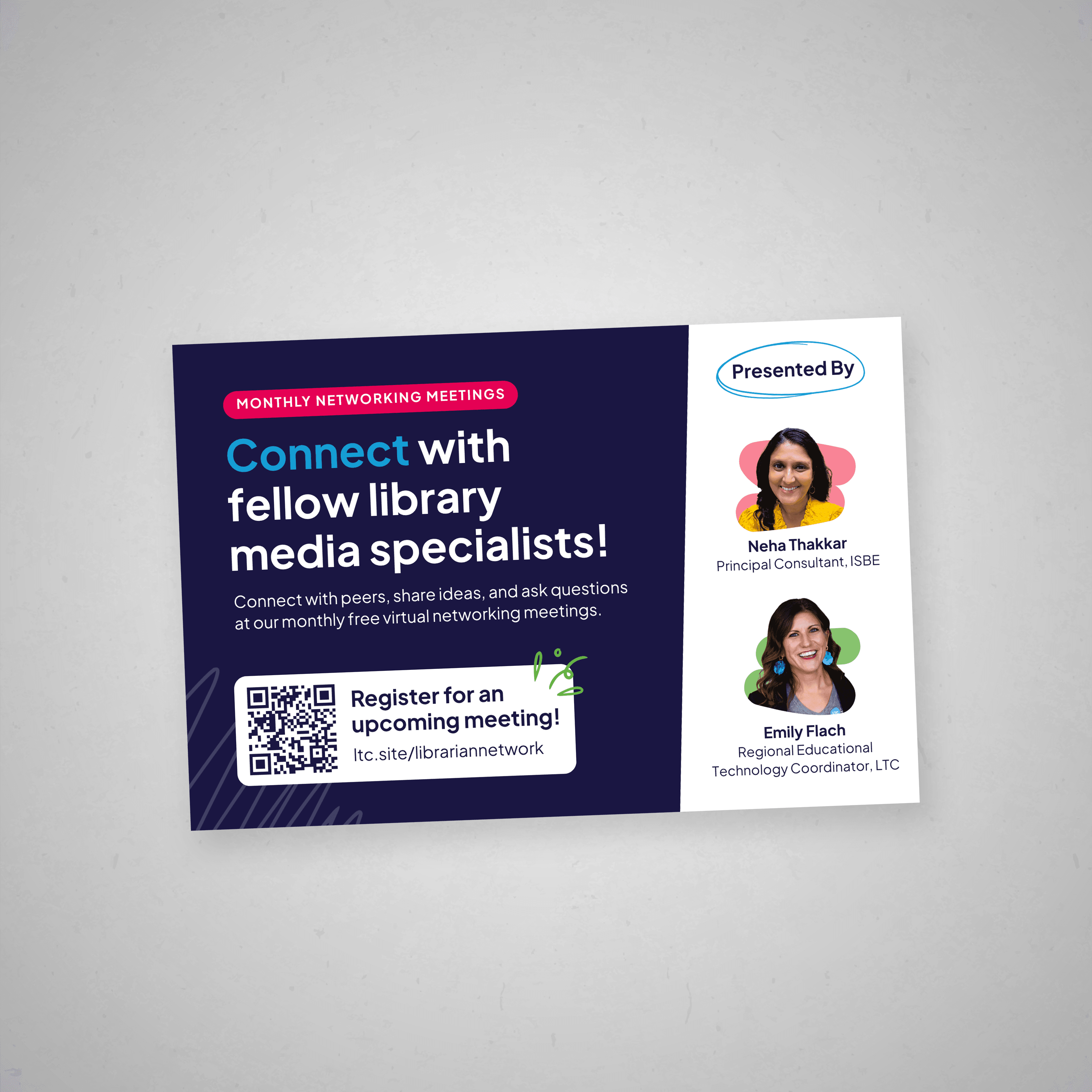
The new visual identity references the original logo while bringing the brand up to speed with modern design language. The primary blue tones reinforce the organization’s connection to technology and trustworthiness, while a clean, geometric sans serif conveys professionalism and legibility. The logo’s organic, abstract form symbolizes adaptability, mirroring how the LTC evolves alongside constantly changing technology. The design is versatile, depending on the audience: it can be playful and inviting for teachers, or refined and professional for administrators. The result is a unified, modern, and user-friendly brand designed to last well into the future, positioning the LTC as a leader in K–12 technology.


